Today, the opposite of tomato "wrote a poem on a dog biscuit, but your dog refused to look at it".
They're breeding...
graphite/21x30cm
There's something quite profound & poetic about the cardboard tubes themselves, mute, ordinary, unassuming & somewhat abject as they are: but how does one communicate such things? That's, as ever, the challenge...
This blog's title is based upon the best question I ever overheard being asked, by a young Liverpudlian child to his mother, as in "What's..?". The answer seems to be something of a creative and cultural nature which, in deed (primarily the making of art) and word, this blog intends to explore...
Sunday, December 16, 2007
Sunday, November 25, 2007
Roll With It...
Today, the opposite of tomato is ‘Growing Flowers by Candlelight in Hotel Rooms’*
… & presenting a couple of quick sketches of compositions of toilet roll tubes - the 2nd perhaps offering Morandi-esque possibilities for development - that could be said to be taking Cezanne's advice to treat nature as 'the cylinder, cone & sphere' but are in fact largely used as a pretext to mentioning a couple of examples of much more aesthetic & poetic uses of such source material & cardboard in general.
both graphite/30x21cm
Firstly, the toilet roll ‘city’ featuring in one of the wonderful hand-made animated segments of Michel Gondry’s ‘The Science of Sleep’, long-anticipated, recently watched & adored. The film itself is a constant source of invention & delight, funny, poignant & generally bonkers, with engaging performances & a pleasingly ambiguous resolution to the protagonists’ relationship: do they end up together – being obviously meant for each other – or not, other than in a dream? One must remain ever-attentive to, amongst other things, the shifts in language between English & subtitled French & live action & animation, which are also often (indeed mostly) combined to highly original & enjoyable effect. The DVD’s ‘making of’ features is a further delight, infused by the same engaging personality(ies) as the film, enlightening in terms of the behind-the-scenes secrets it reveals yet managing not to detract at all from the essential magic & poetry of the production, even serving to increase one’s amazement at & admiration of the manner in which things individually & the whole itself were achieved. The labour (of love) intensive, home-made, hand made quality of the cardboard tableaux, the Stephanie character’s ‘knitted’ soft objects, the cardboard car that features in the police ‘chase’, Stephane’s cardboard TV set, the gadgets, all are such wonderful constructions, aesthetically & inventively in their eccentricity. Watch this film & fall in love with it!
Also the fascinating paintings of William Daniels, recently discovered. Constructing maquettes of familiar paintings – anything from the Renaissance to the modern era & up to date, e.g. Georg Baselitz – from torn paper & cardboard (discarded cigarette packets, toilet roll tubes, etc), folded, ‘sculpted’ & taped, Daniels then produces highly detailed & realistic, mostly monochrome paintings of these crumpled, distressed-looking models. A relationship with Cubism seems particularly apparent, from the paintings’ colouring, tonal subtleties & the collage nature of both the models & the subsequent paintings’ style
The maquettes are interesting enough in themselves & amusing in their abject, idiosyncratic appearance, especially when traced back to their sources, e.g. a series of Cezanne’s Mont Sainte-Victoire. At first, I thought these had merely been photographed & presented as such, & were perfect enough in that, but the realisation that they are paintings – & an original twist on the still life genre, contemporary whilst referencing the history of art & establishing a dialogue with these traditions & individual artists - takes them onto a whole new level of wonder.
‘David with the Head of Goliath’ (Caravaggio)
… & presenting a couple of quick sketches of compositions of toilet roll tubes - the 2nd perhaps offering Morandi-esque possibilities for development - that could be said to be taking Cezanne's advice to treat nature as 'the cylinder, cone & sphere' but are in fact largely used as a pretext to mentioning a couple of examples of much more aesthetic & poetic uses of such source material & cardboard in general.
both graphite/30x21cm
Firstly, the toilet roll ‘city’ featuring in one of the wonderful hand-made animated segments of Michel Gondry’s ‘The Science of Sleep’, long-anticipated, recently watched & adored. The film itself is a constant source of invention & delight, funny, poignant & generally bonkers, with engaging performances & a pleasingly ambiguous resolution to the protagonists’ relationship: do they end up together – being obviously meant for each other – or not, other than in a dream? One must remain ever-attentive to, amongst other things, the shifts in language between English & subtitled French & live action & animation, which are also often (indeed mostly) combined to highly original & enjoyable effect. The DVD’s ‘making of’ features is a further delight, infused by the same engaging personality(ies) as the film, enlightening in terms of the behind-the-scenes secrets it reveals yet managing not to detract at all from the essential magic & poetry of the production, even serving to increase one’s amazement at & admiration of the manner in which things individually & the whole itself were achieved. The labour (of love) intensive, home-made, hand made quality of the cardboard tableaux, the Stephanie character’s ‘knitted’ soft objects, the cardboard car that features in the police ‘chase’, Stephane’s cardboard TV set, the gadgets, all are such wonderful constructions, aesthetically & inventively in their eccentricity. Watch this film & fall in love with it!
Also the fascinating paintings of William Daniels, recently discovered. Constructing maquettes of familiar paintings – anything from the Renaissance to the modern era & up to date, e.g. Georg Baselitz – from torn paper & cardboard (discarded cigarette packets, toilet roll tubes, etc), folded, ‘sculpted’ & taped, Daniels then produces highly detailed & realistic, mostly monochrome paintings of these crumpled, distressed-looking models. A relationship with Cubism seems particularly apparent, from the paintings’ colouring, tonal subtleties & the collage nature of both the models & the subsequent paintings’ style
The maquettes are interesting enough in themselves & amusing in their abject, idiosyncratic appearance, especially when traced back to their sources, e.g. a series of Cezanne’s Mont Sainte-Victoire. At first, I thought these had merely been photographed & presented as such, & were perfect enough in that, but the realisation that they are paintings – & an original twist on the still life genre, contemporary whilst referencing the history of art & establishing a dialogue with these traditions & individual artists - takes them onto a whole new level of wonder.
‘David with the Head of Goliath’ (Caravaggio)
Mont Sainte Victoire (Cezanne)
'The Forest on its Head' (Baselitz)
'L'Origin du Monde' (Courbet)
Still Life (Morandi)
(* & reading Richard Brautigan, again)
Sunday, November 11, 2007
Cinq Quinces
Sunday, November 04, 2007
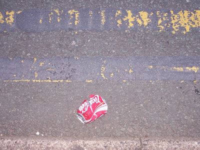
Pop Art Roadkill
A constant factor in 'the life aesthetic' as lived is the coincidence between art & life - almost everything one encounters can be referred & analogised to art of some form or another, most often that of a visual nature.
A case in point occurred a couple of days ago, after having posted the Jasper Johns-inspired/influenced drawings made from the earlier photos of local 'double black line' road markings. It seems obvious that I should then notice, at the kerbside & adjacent to said double black lines, a crushed cider can which of course relates (when living aesthetically) to Jasper's 'Painted Bronze' (1960) sculpture of a pair of Ballantine ale cans. And then, chronologically, both art-historically & along the course of my journey, from Johns on to Pop art in the form of 2 'roadkill' Coca-Cola cans...
Thursday, November 01, 2007
Wednesday, October 31, 2007
The Road to Johnsville...
In a separate body of work to the still lifes of late, I've finally got around to using the previously-taken sets of photographs of local roadside 'double black lines' (see old posts in the dim & distant) as intended, as source material for investigations into modernist-type image-making, concentrating on process (explicity so, as an illustration of the temporal nature of both the 'work of the work of art' & also the act of looking), mark-making, surface, etc. Studying the excellent publication 'Jasper Johns: an Allegory of Painting 1955-1965' & in particular the wonderful & fulsome reproductions therein, I've been influenced & inspired by & thus attempted something along the lines of Johns's ever-fascinating mark-making endeavours using pre-existing, 'already known' images as the beginnings of such. Gradually, it's beginning to make more sense (from never having worked from photographic sources previously) & perhaps is a line of work it might be worth pursuing, possibly involving a return to the sources of the images to obtain more direct, immediate visceral information from which to work...
(all drawings 30x21cm, graphite &/or plastic & putty erasers - no.2 also utilises charcoal)
Tuesday, October 30, 2007
29th October
11th October
Set up the quinces 'contre-jour' for a change - fascinating to observe their changing forms as the sun moved in the sky & to appreciate just how fugitive 'appearances' can be, just how magically light describes form. Impossible to successfully capture, however, even when such a drawing as this attempts some form of synthesis of progressive states of illumination.
graphite/30x21cm
graphite/30x21cm
29th September
16th September
15th September
The colours presented by the quinces seen against the background of a bright, rich turquoise-blue envelope were just too appealing not to want to explore in colour too.
Still looking closely at Uglow, & the presence of Cezanne is a given - took recent advantage of the National Gallery book sale to obtain the catalogue of last year's 'Cezanne in Britain' exhibition, which was a profound pleasure to attend, to be able to see the paintings & watercolours themselves & appreciate the wonderful touches & subleties that went into bringing the work to life was indeed an education.
graphite & watercolour/30x22cm
Here's another Uglow, his frequently employed blue backdrop (with geometric divisions) again providing an obvious reference & inspiration ('Two Pears' 1990 from the previous post also features a deep blue 'wall' behind).
Euan Uglow 'Chinese Pear' 1990
14th September
Gradually taking a more tonal approach to the subject whilst still attempting to 'dynamise' the space between the objects.
graphite/30x21cm
Here are a couple of examples of Uglow's work which I've been studying & are providing obvious inspiration: Andrew Forge, indeed, writes on the first painting of the gap between the two pears being "charged with energy".
Euan Uglow 'Two Pears' 1990
Euan Uglow 'Two Pears' 1998
graphite/30x21cm
Here are a couple of examples of Uglow's work which I've been studying & are providing obvious inspiration: Andrew Forge, indeed, writes on the first painting of the gap between the two pears being "charged with energy".
Euan Uglow 'Two Pears' 1990
Euan Uglow 'Two Pears' 1998
13th September
9th September
2nd September
1st September
Rebranding 'The Life Aesthetic...'
Enough, already, with the cyber-procrastination, the non-blogging, not updating, etc.
The decision taken to rebrand the blog formerly known as 'The Life Aesthetic..' (which did actually continue, despite the lack of posts descriptive of & pertaining to) seems the perfect opportunity to breathe a little life back into this moribund resource, the cyber arm of aesthetic & cultural operations.
Thus, 'The Opposite of Tomato', which has been for the better part of the last 5 years my all-time favourite question. Overheard being asked by a Liverpudlian child, to its mother, & seeming to present the philosophical conundrum par excellence, it's been something deemed worthy of almost constant pondering: indeed, such might be said to be a prerequisite of 'the life aesthetic' & the ever-vigilant state of consciousness & apprehension this modus operandi itself requires.
'The opposite of tomato' could indeed be just about anything, of course, dependant on context or whatever, but somehow it seems the answer must lie out there in the great space of culture, & perhaps more specifically art of a visual nature...anyhoo, whatver might be subsequently posted here is intended to in some way address this question (as indeed has everything previously posted). Here goes...
Monday, July 16, 2007
Found ‘Still Life’ in the Landscape
A new year stroll along a local woodland trail resulted in an encounter with a couple of curious readymade ‘still life’ arrangements featuring discarded items of clothing - all clean and in a wearable condition, as may be readily observed - as their subject matter. The first intrigued me particularly through the manner in which a pair of jeans had been carefully folded and draped upon a convenient ‘plinth’, exhibited as might be an artefact or object of interest for the convenience of passers-by. For anyone even vaguely versed in the methods of contemporary artistic practice and display, such an ‘installation’ might not appear especially surprising, yet still the jeans’ presence, deliberately placed upon a pedestal thus, invites speculation as to the ‘why’ and ‘how’ of such, draws the beholder into their (human) narrative and might also encourage imaginative expansion of the story in anyone so inclined.
Further along the trail were to be found more clothes, this time a collection/selection of such, more casually scattered yet still with something of a suggestion of being composed, particularly the manner in which the sleeve of the dark blue top, set apart from the others, grouped, points to the red & black one, which itself is positioned at a narrow interval apart from the main group, establishing an element of spatial dynamic as might be expected to exist between the elements of a still life composition. The naturally scattered elements such as leaves & twigs also contribute to the picture created, the whole composition of objects and the ‘tactile space’ (see Georges Braque) of the ground.
Of course, it’s just as possible to view these discarded clothes not as in some way being artistic, their placement as being in any way creative, but their presence as being, rather, invasive, even destructive - simply alien to & littering the environment. The surprise element of seeing such vividly-obvious evidence of human presence along the trail draws one’s attention then to just how much other stuff has been abandoned by people along it (from such expected small-scale items as food packaging to those perhaps less so and somewhat larger including dumped & decomposing furniture and burnt-out vehicles) and its immediate wooded environs. Subsequently, one might then consider the fact that the trail itself is man-made (as indeed was the railway which, falling into disuse and abandoned, preceded it), facilitating human passage through the natural, ‘unspoilt’ environment and thus the potential for discarding foreign elements amidst it. This then inevitably suggests questions about larger, even more permanent man-made and wholly unnatural interventions in, intrusions into, the natural world and, perhaps, the environmental consequences of such. But still one returns to the original point and the presence of ‘art’ - deliberate or merely just perceived as such by someone possessed of the sensibility or imagination to do so - in the landscape.
Subscribe to:
Posts (Atom)