Today the opposite of tomato is a bijou flat with the fraternity cat
graphite & putty eraser, with watercolour/20x30cm
A second drawing, following on from the previous example, taking as its source material photographs from late 60s-early 70s vintage football annuals, again the details of the action appropriated from two separate images, thus creating a match scenario that never actually occurred – not exactly ‘fantasy football’, perhaps, but at least something of an imaginary nature.
Further to this invented aspect (which might be able to be considered as a component of the concept of ‘de-photography’, in addition to that of the process of drawing?), & to the subject of football as a subject for (sustained) artistic practice, the recent discovery of Marc Renshaw’s ‘The Sporting League’ project presents a fine inspirational example. It’s a fully-realised, idiosyncratic body of work developed over a number of years, in effect a whole parallel football universe with its own recognizably familiar (to anyone with an acquaintance with the real thing, however detached from everyday reality that itself might be) culture, teams, league & cup competitions, statistically documented & illustrated, also including a blog that regularly, systematically updates proceedings.
In the most basic manner, this relates in some way to various endeavours of my own over the years since childhood &, most pertinently, what still might be an ongoing one, however dormant it might have lain more recently – I’d never considered my occasional ‘fantasy leagues’ to be in any way art practice (the handwritten archives of results & tables not being thought of as drawings, for example), but perhaps the degree of creativity applied to an alternative world where, although not featuring wholly invented teams in the manner of Marc Renshaw, actual football minnows such as Mossley, Gainsborough Trinity & Marlow are among the leading lights & most-oft champions of the English league structure, & Marlow indeed have become the first English team to have won the European Cup, might lead to something of a reappraisal: perhaps it’s this I should be using the practice of drawing to illustrate & add a simultaneous pictorial dimension to.
In other news, a recent browse in a local Oxfam bookshop unearthed a most interesting find, of a copy of the book ‘You Are an Artist’, a title I recalled also being found in a charity shop some time ago by Jazz Green. In keeping with the period flavour & aesthetic of current proceedings here at TOoT, the book was published in 1965 (reprinted in 1967) & appears very much as a classic of its time: it also seems to be a fine instructional & inspirational volume, lavishly illustrated with ‘masterful’ examples of art across a range of media, as well as those of the author, Fred Gettings, & other contemporaries, & of work produced by students & children, accompanying a serious, substantial text offering sound practical advice & historical context, a quite lovely book indeed.
Part of the reason for investing in the book, its period charm apart, is the fact that its title should serve as a motivational reminder: however, given the slow & unfocussed progress of work over the last year, perhaps a certain critical amendment might be in order & more appropriate…
Soundtrack:
Serge Gainsbourg 'Histoire de Melody Nelson'
Belle & Sebastian 'The Life Pursuit' & 'The Boy With the Arab Strap'
With thanks to A for the present of the wonderful Gainsbourg album set.
This blog's title is based upon the best question I ever overheard being asked, by a young Liverpudlian child to his mother, as in "What's..?". The answer seems to be something of a creative and cultural nature which, in deed (primarily the making of art) and word, this blog intends to explore...
Monday, February 27, 2012
Saturday, February 18, 2012
Back of the Net...
Today the opposite of tomato is 'a man who's nostalgically prone'
graphite & putty eraser, with watercolour/30x20cm
Another return to previously-featured subject matter over this last week, but on this occasion with rather more of a purpose than would have incidentally been the case with any past instances as occurring during 2008’s Project of drawing from media image sources.
At that time, I mused upon the general paucity of football featuring as suitable subject matter for representation within the context of fine art &, indeed, despite a long-standing interest in the game, constant with certain fluctuations of intensity, it’s not something that’s particularly inspired me in creative terms, at least since after childhood & the serious study & continuing practice of art.
However, a certain correspondence of recent circumstances seems to have ignited a little flicker of possibility for the production, for now, of some drawing based upon archive photographs of professional football match action as found in a small (but perfectly formed) selection of late 1960s – early 1970s annuals that have come into my possession of late: rather serendipitously, this covers the latter half of the period about which I always seem to have been most nostalgic, both in general socio-cultural terms & specifically in relation to football, despite it immediately pre-dating the time at which I began following the game in earnest.
The annuals themselves are full of the black & white photography of the time that lends a particular glamour to the action & the portraits of the players featured within, & it is these images that will provide the source material for the drawings, a series of, as imagined & intended.
As always, aside from this especial ‘period’ aesthetic quality, another aspect of the appeal of such images is their capture of movement, of human bodies & objects, frozen in time, emphasizing the instantaneous nature of the ‘photographic moment’, with the drawing process from any such source then in turn emphasizing its difference from via the medium of the explicit, discrete marks made, each of which has its own temporality embedded within, the accumulation of marks in any given drawing communicating a sense of the passage of time involved in its construction - quite literally ‘marking time’, it might be said.
Again, the still-nascent concept of ‘de-photography’ comes to mind, & how the (slowness of the) drawing process embodies this, particularly, perhaps, from such sources as images depicting action in the manner of the football matches.
Further to the practice of ‘de-photography’, the drawing is the product of details appropriated from two source images, thus depicting an incident that never actually took place, revising (photographic) history along the way.
The design of the back cover of the 'All Stars' annual, featuring an ink-drawn representation of a pair of footballers in action only served to provide more inspiration, as might be appreciated...
By way of further explication of the overall appearance of the drawing, the acquisition of the football annuals happened to coincide with the decision to invest in the rather wonderful ‘Own Brand’, a visual history of the work of Sainsbury’s in-house design studio, the results of which, obviously, went on to grace the packaging of their own brand range of goods & products, not least those as appeared on the stores’ shelves during the halcyon days of the 1960s & 1970s, many a delightful example of which is represented within the pages of this handsome volume: the keen viewer might appreciate how the cover design itself, visually quoting as it does a classic Sainsbury’s ‘cornflakes’ packet design of the author’s fond recollection, influenced the design aspect of the football drawing, the arrangement of circles suggesting the faces of the crowd as seen, en masse & homogenized out of focus, as the background to the on-pitch action in the archetypal football match photograph.
By one of those serendipitous quirks, this particular aspect was in fact that upon which I must have concentrated, recalling the drawing I made based on the very first televised football match I ever showed an interest in, the 1974 FA Cup Final, obsessively recording a multitude of pink felt-pen circles representing what appeared the vast crowd at the expense of drawing the Newcastle United team’s shirts with horizontal rather than their correct vertical black & white stripes, as my father critically observed later!
On the subject of aesthetic influence as it pertains to the current drawing, another recent addition to the library shelves happens to be ‘Match Day’, an illustrated survey, ‘from Post-war to Premiership’ (i.e. 1992) as it’s subtitled, & celebration of football programme cover design, featuring all 92 Football League clubs & some additional examples from ‘non-league’, coincidentally also published, as the Sainsbury’s book, by Fuel. Again, such a volume presents a veritable cornucopia of delights of graphic design, some of a higher standard than others, very often incorporating photographic images of football action, as one might imagine, both something of a nostalgia-fest & grist to the creative mill under the present circumstances.
Soundtrack:
Belle & Sebastian 'Write About Love'
Galaxie 500 'The Peel Sessions'
Dome '1 & 2'
Moon Wiring Club 'Shoes Off and Chairs Away'
Labels:
drawing,
football,
graphic design,
watercolour
Tuesday, February 14, 2012
Handy Find
Almost mid-way through February seems rather late to be posting the first fruits of the drawing practice of the month, so, without further ado:
graphite & putty eraser/30x20cm
Harking back to 2008’s Project here at TOoT, essentially engaged with the graphite representation of media photographs (preferably suggesting some form of art-historical contextual affiliation) as they occurred in the press over the course of the year, the source image from which the drawing was processed was found one day recently whilst browsing the G2 section of The Guardian, & proved irresistibly attractive as a suitable case for further study & such treatment.
The picture is so rich, in terms of its 1960s period appeal, the wonderful, ineffably sad face of Tony Hancock, pictured in conference with the writers Alan Simpson & Ray Galton, the tonal chiaroscuro so redolent of the history of European painting from the Renaissance to the 19th century (consider Caravaggio, Velasquez & Rembrandt as but three examples) &, particularly, the ‘Caraveggiesque’ gesture of Hancock’s extended hand, observed in perspective, which recalls a number of instances as occur in the paintings of Caravaggio & his ‘Supper at Emmaus’ most specifically, perhaps (indeed, the whole subject of the photograph implies such a gathering, it seems to be very much in the tradition of, with the composition of figures seated around a table top arrangement of receptacles, cutlery, food & drink. The bearded profile of Galton, too, to the right, seems familiar from any number of painted historical precedents).
Caravaggio 'Supper at Emmaus' 1601-02
oil on canvas/195x139cm
The immediate source from which the drawing was processed was in fact a photocopy (as had become the development in practice when the media photograph project continued for a while into 2009), a further layer of representation & distance from source, the image thus degraded slightly from its appearance in the printed newspaper, with certain losses of tonal subtlety &, accordingly, detail: the G2 ‘original’ was subsequently referred to if occasional particular issues for the requirement of clarification occurred.
The nature of the specific print of the photograph in the newspaper, across a two-page spread, creating a definite split of the image into two (unequally sized) halves, & the photocopy of this physical manifestation, significantly informed the transcription into drawing, with the space of this fissure incorporated into the picture plane as an active element: it’s particularly notable how this space divides the extended hand. Given the nature of this particular formal quality, &, subsequently, that of the drawing as informed by, &, of course, considerations of the relative slowness of the drawing process in relation to the photographic one (even allowing for the time involved in the developing of the original print from the negative of the image as photographed instantaneously), thoughts have returned to the concept of ‘de-photography’ (first mooted & mused-upon during November 2008), whereby the representation from source(s) becomes a significantly different, separate entity.
Friday, February 10, 2012
Tiffin Time
Thursday, February 09, 2012
Mist Again
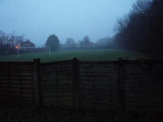
Despite previous implications of not wanting to devote visual operations exclusively to the photographic recording of the view beyond the back garden fence, still we find ourselves aesthetically seduced by the scene of the playing field as wreathed in mist, in the encroaching gloom of the late afternoon, captured on this occasion in appropriately grainy fashion, with overall pictorial detail being lost to general atmosphere. From the vantage point of the camera, the distant glow of orange light, the one sign of brightness & life to be observed in the romantic desolation of the scene, finds itself neatly perched at the junction of goalpost & crossbar, a neat pictorial highlight.
Tuesday, February 07, 2012
Foggy Notion
Without wishing proceedings here at TOoT to become fixated upon the prevailing atmospheric conditions outdoors, yet we (re)present here the latest prospect of the field beyond the back garden fence as pictured soon after daybreak this morning, in its fog-shrouded state still exerting a romantically melancholy attraction. On this particular occasion, note the almost-disappearance of the more distant set of goalposts into the enveloping fog, lending the scene, with merely the near posts remaining effectively visible, a more desolate, abandoned air again.
Monday, February 06, 2012
Another Mist Opportunity...
A familiar scene by now, of the view over the back garden fence, mossily patinated, of the field with goalposts beyond, this evening wreathed in a light mist through which can be seen palely shining the moon, which turns thoughts to the 'Wiring Club' of that ilk, accompanying those of similarities to the aesthetic of George Shaw that inform such a picture, of a certain banality, melancholy & yet also perversely romantic as it seems.
Subscribe to:
Posts (Atom)