Wednesday, February 15, 2006

Pears-as-Drawings

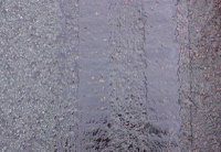
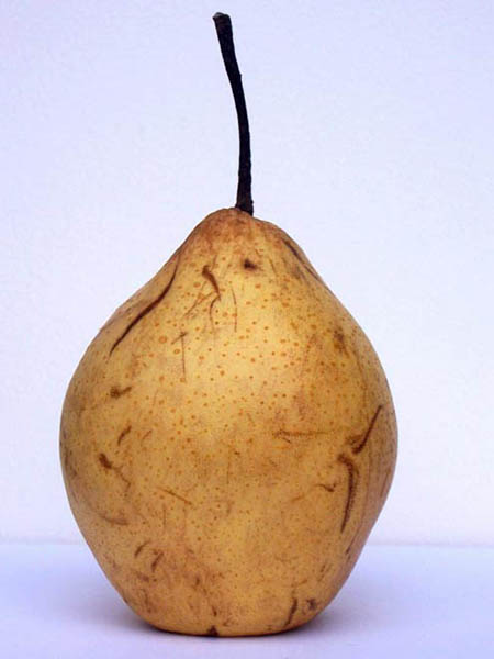
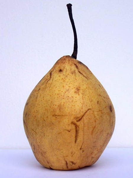
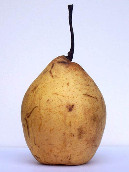
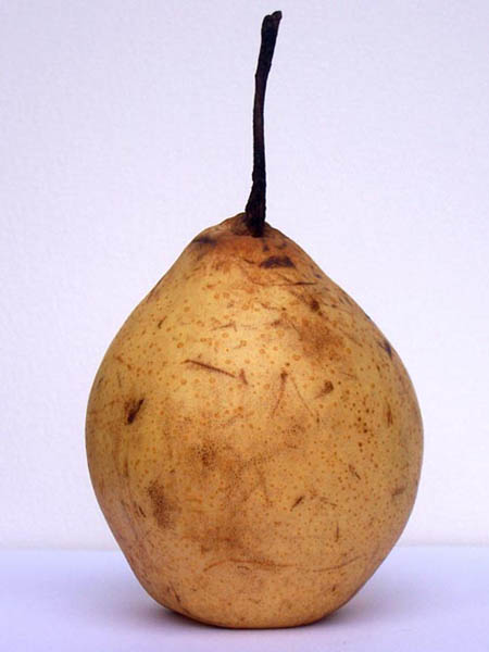
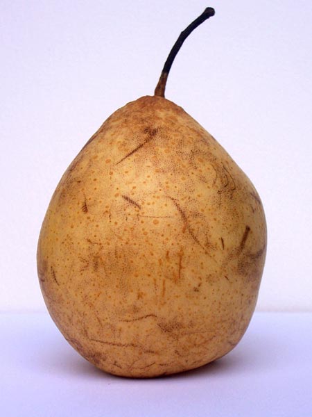
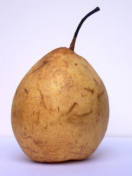
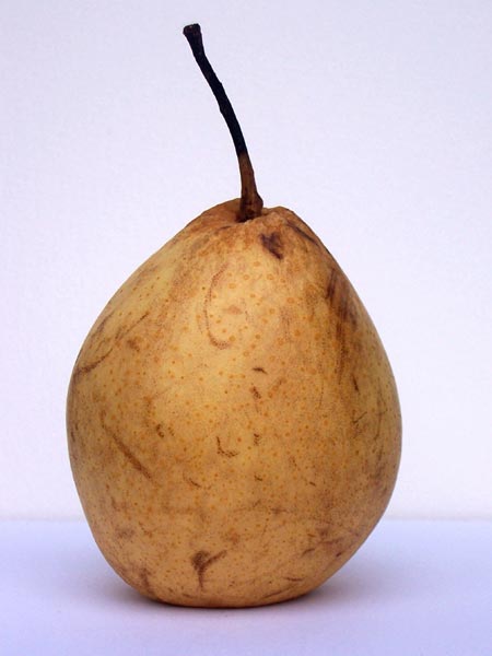
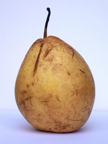
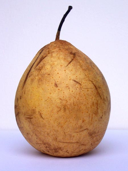
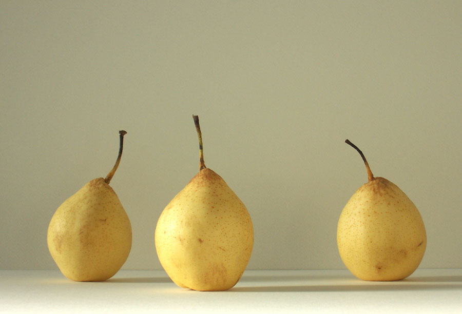
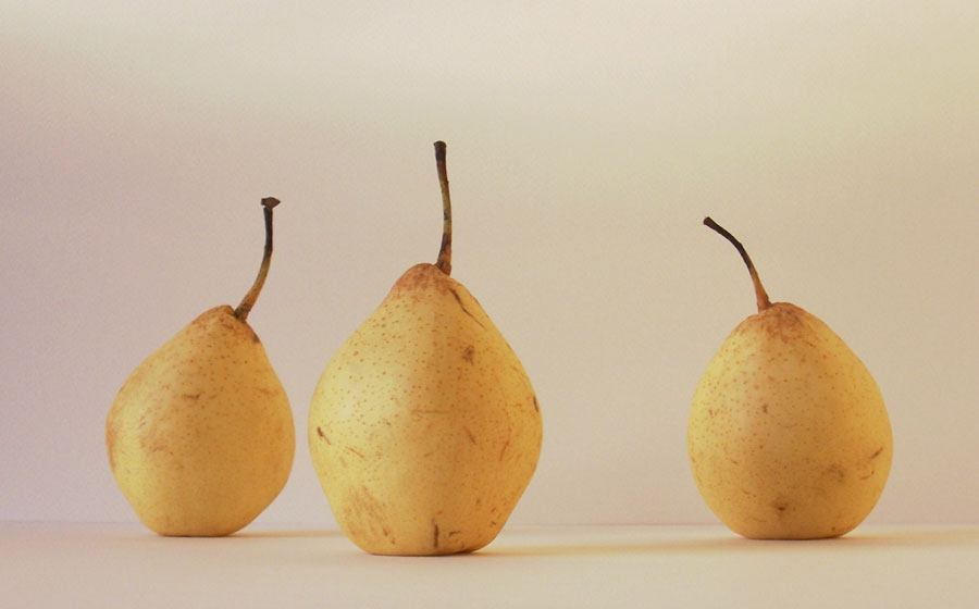
Returning to the subject of the pears of previous recentish posts, I noticed with aesthetic interest how, with the passage of time, their skins were developing a network of lines, mostly fine but some broader & more deeply scored - the pears in effect creating ‘drawings’ over their own surfaces, naturally, ‘automatically’ of their own accord in combination with environmental factors. Having recently watched Peter Greenaway’s film ‘The Pillow Book’, an aesthetically ravishing visual feast in itself, my attention was particularly heightened to this phenomenon, which seemed worthy of photographic record: below are presented 2 composite views of a series of sequential points around the circumference of the pears to illustrate the nature of these ‘drawings’.

By way of digression, the essential narrative of ‘The Pillow Book’ revolves around a young Japanese woman’s particular, idiosyncratic interest in calligraphy, which manifests itself in a somewhat fetishistic obsession with writing on the body, on human skin, an interest awakened by her calligrapher father’s habit of writing on her face and neck as a form of birthday greeting, and then developing into her adolescence and adulthood as a desire to have her body written upon and, subsequently, of doing the same to others, lovers, etc, herself, this latter being the device by which she contrives to achieve publication of her own previously rejected ‘pillow book’. It’s very sensual to see human skin, male and female, being used as the ground onto which text is applied, especially by gorgeous Japanese calligraphy brushes, and beautiful to appreciate the art itself. There’s a beauty too, I think, to the interplay of the combination of the delicate tracery of marks or more thickly 'carved' ones inscribed on the pears’ skins & a certain wonder in the process of their occurrence, a natural aesthetic ‘happening’.

(click on the images to access the full-sized versions)


Monday, February 13, 2006

Road Art

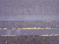
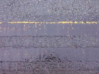
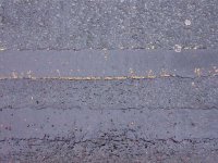
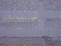
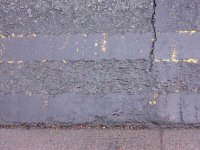
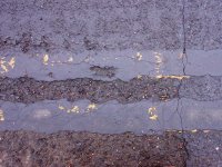
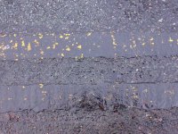
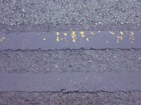
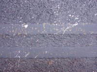
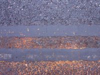
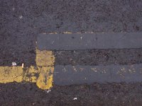
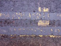
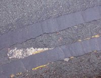
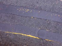
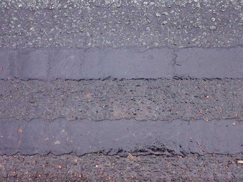
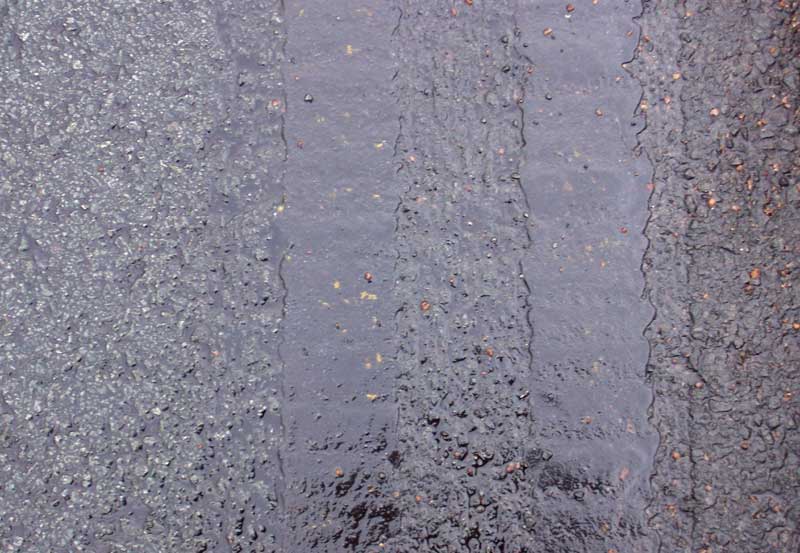
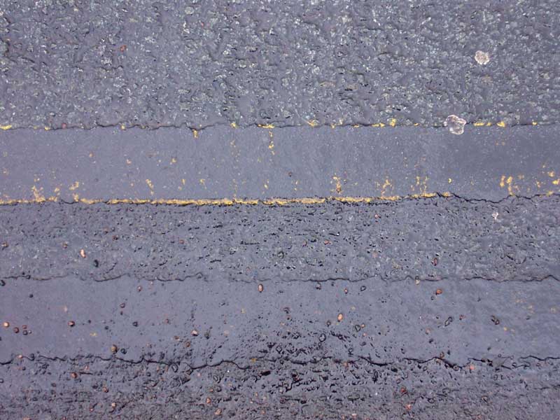
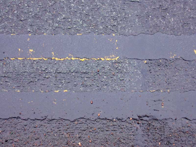
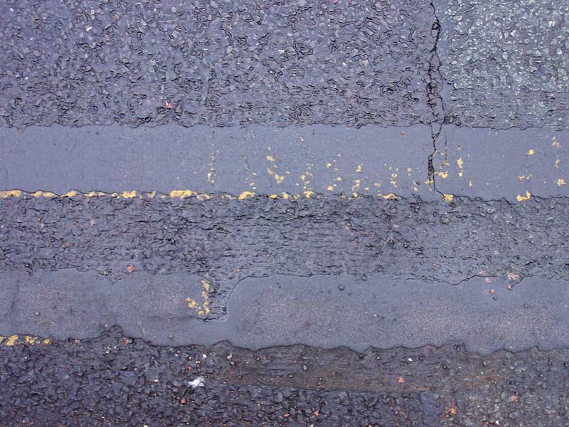
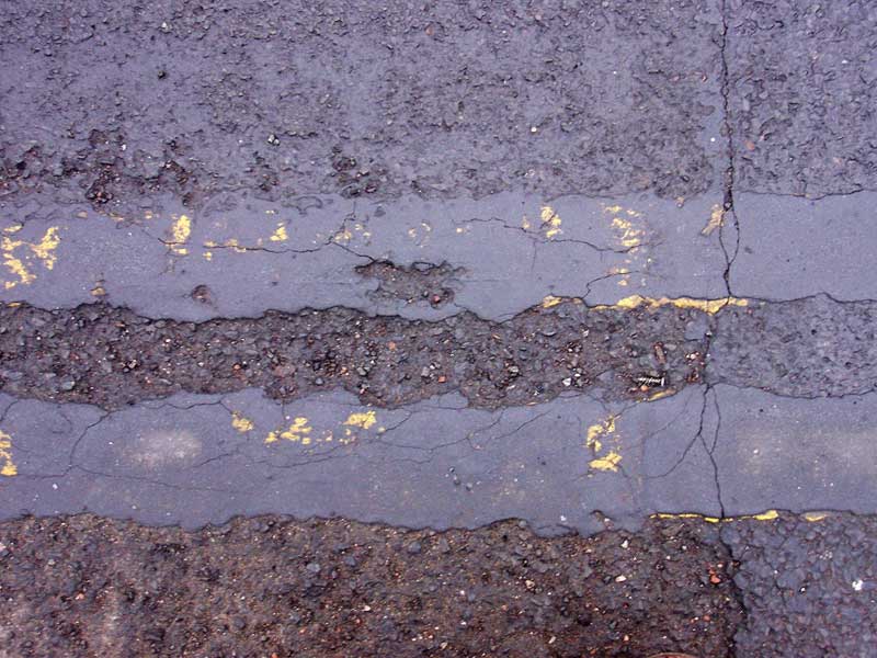
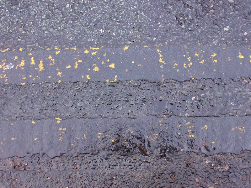
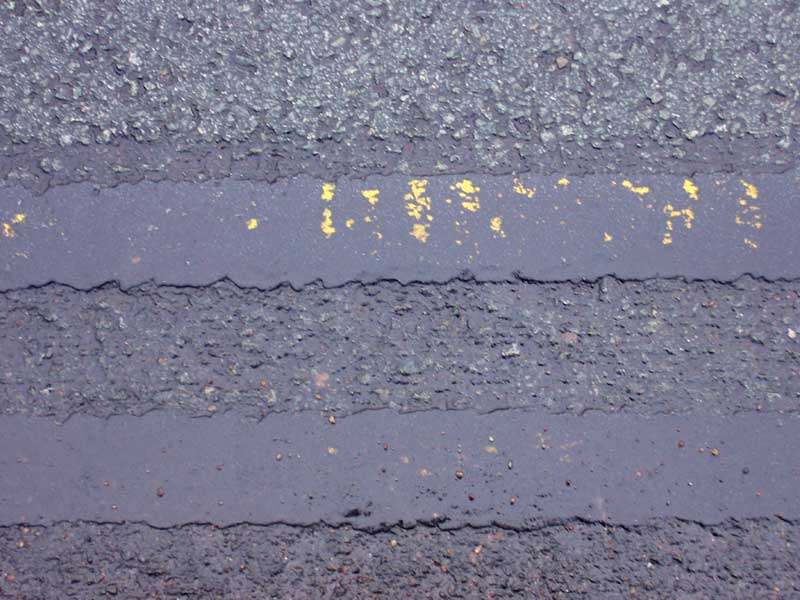
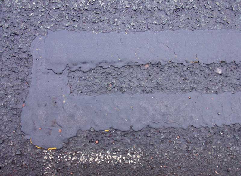
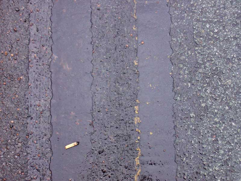
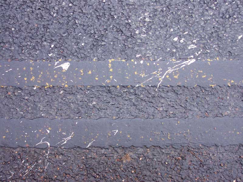
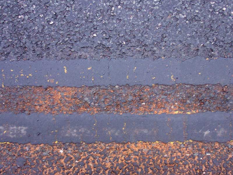
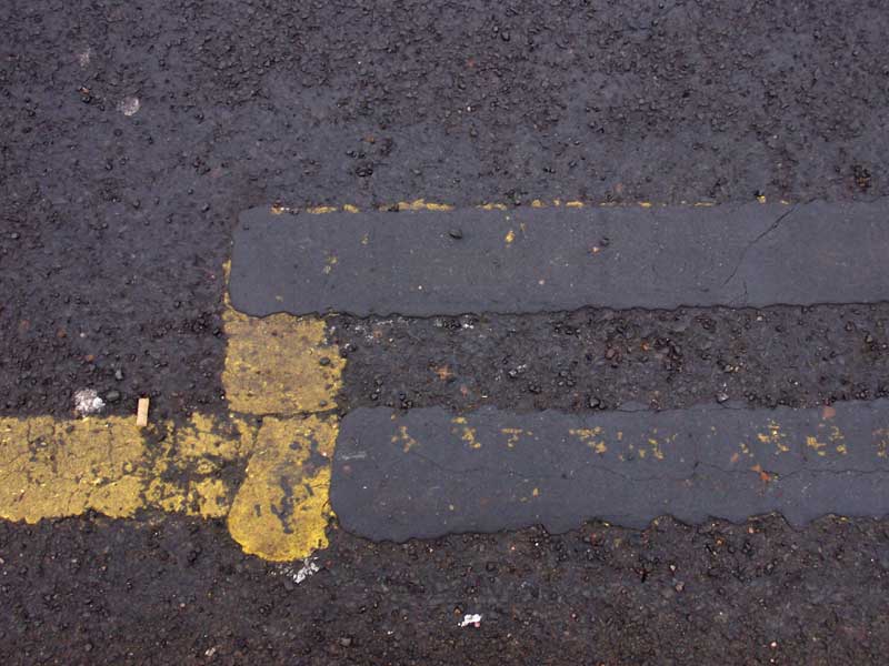
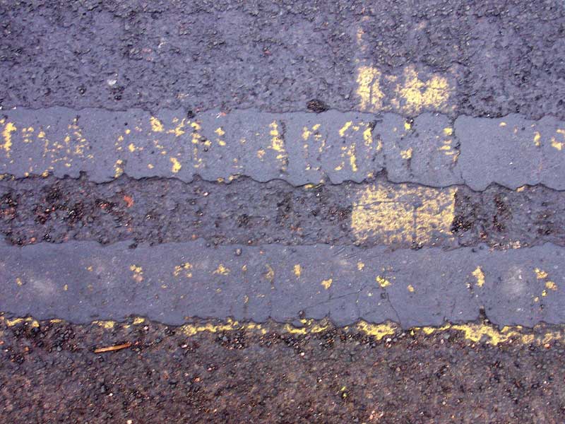
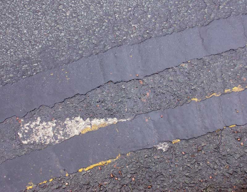
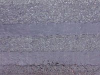
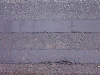
Indulging in a spot of shoegazing – old habits, literally & musically, dying hard & all that – resulted in a wonderful aesthetic find at the roadside, in the form of these quite possibly unique local ‘double black line’ road markings. They are in fact the result of a cover up operation to correct the problem of erroneously painted double yellow (vehicle parking prohibited) lines, liberally applied over extensive areas to which they shouldn’t have been. Although the black lines obviously, under such circumstances, serve a functional purpose, still I believe they deserve to be viewed as art, &, indeed, primarily so. To me, the photographs are like reproductions of a series of paintings - relating to the work of, e.g. Robert Ryman (in effect, the black images could be regarded as being 'negatives' of Ryman's white paintings), Ad Reinhardt, Barnett Newman, rather than the obvious initial ‘red herring’ reference to the work of the Boyle family & their physically modelled replicas of areas of the earth’s surface, including, specifically, sections of Tarmacked urban road - simple, modernist-minimalist compositions, yet incorporating a wealth of subtle detail in terms of:

1. colour & tonal variations on the basic ‘black’ theme (provided by both the essential distinction between the lines and the road surfaces they overlay &, in some instances, between the various patches of the repaired roads which, on occasion, can be numerous and quite varied);
2. drawing, both obviously in the lines (& their wonderful wavy, ‘uncertain’, ‘exploratory’ edges) themselves but also in the networks of cracks upon the paint surface & fissures in the underlying road surface, & furthermore in the strips of the leading edges of yellow paint left untouched by the cover up process;
3. a tangible materiality to both figure & ground - textured, ‘tactile’ space as can be found in painting;
4. a physical memory of the cumulative traces of the process of their creation & revisions (which applies to both the over-painted lines – obviously so where the underlying yellow paint shows-through - & the repaired road surfaces);
5. incidental elements, e.g. cigarette butts that neatly ‘art-reference’ the detritus embedded in the surface of some of Jackson Pollock’s paintings, paint splatters that also reference Pollock most obviously, or an engrained sprinkling of builders’ sand that adds another colour to the composition;
6. other road markings deliberately left untouched by the cover up process that again expand the compositional range.

For whatever reason – perhaps most obviously because a greater range of line detail is possible in such a format – it seems a horizontal composition is most effective, at least at this initial stage of exploration, but, displayed vertically, the markings more closely relate to, for instance, Barnett Newman’s ‘zips’, which again is fun for playful ‘referencing’ purposes, & curved areas of line provide another dynamic to the compositions altogether & suggest further possibilities.

Click on the images to access full-sized versions (this, indeed, applies to all the images posted on the blog).
Sunday, February 12, 2006

Friday, February 03, 2006

The Light Fantastic

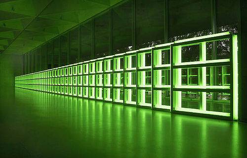
There’s a fine review of the current exhibition of Dan Flavin’s work at the Hayward Gallery in London here on the Observer website, most inspiring – the show is surely a must-see if one has the opportunity to do so.

I recall seeing a smaller selection of Flavin’s fluorescent tube sculptures at the Serpentine Gallery in the summer of 2001, & one of the exhibits in particular, 'untitled (to you, Heiner, with admiration and affection)', a room-wide installation, was ravishing, with the green light of the tubes flooding the space & producing an amazing, stunning optical illusion in rendering the view outside through the room’s windows, of the grass & trees of Hyde Park outside, in shades of pink & violet, the natural world transformed into something apparently synthetic(ally coloured) – the fact of being able to explain such a phenomenon scientifically does nothing to diminish the magic of the aesthetic experience, of being there in the moment, amidst such a presence. Here’s an image of the work, alas without a complementary view outside & thus lacking that effect.

Thursday, February 02, 2006

Objets d’Art

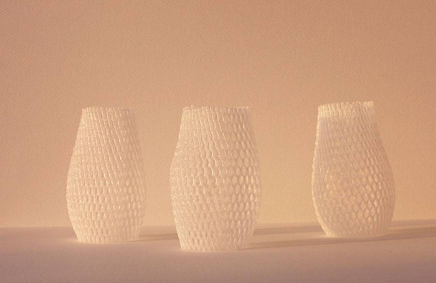
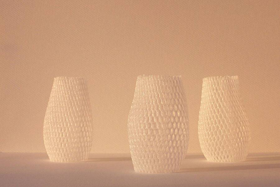
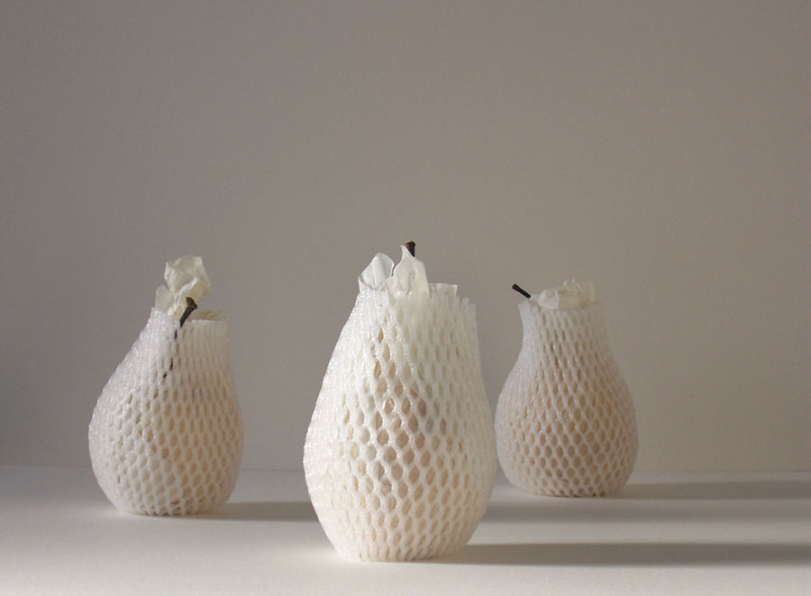
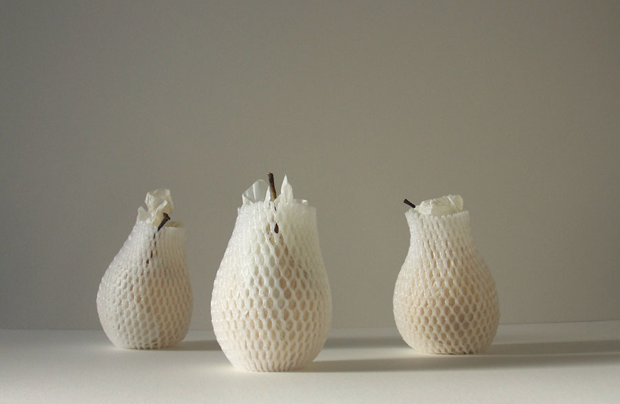
Freed from their functional purpose, I found the cocoons that had been protecting those Chinese pears as featured in recent posts to have, whilst retaining their visual interest as textured surfaces, something of another aesthetic quality altogether (indeed, liberated from their ‘usefulness’, the cocoons could be argued, if one should subscribe to a particular philosophy, to exist now as art, as purely aesthetic objects) & thus suitable further potential as photographic subject matter.

For all their apparent lacy, flimsy, transparent insubstantiality as actual, physically-experienced objects, still, within a photographic context at least, the cocoons retain a sense of form & physicality &, though their shape still echoes that of the pears formerly present within, because of the actual absence of the pears & the consequent ambiguity of scale of the cocoons, a certain structural, sculptural solidity if not, perhaps, the sheer presence & monumentality of the pears, covered or otherwise. Retaining a sense of the weight of the pears formerly contained within also seems to lend the cocoons a sense of substance.

With late afternoon sunlight raking in at a low angle, sharp, imposing shadows were produced & incorporated into some compositions as another element of the whole, in order to add a further dimension, to introduce some complementary dark tonal areas into the overall ‘lightness’.


Wednesday, February 01, 2006

Drawing & Painting vs. Photography

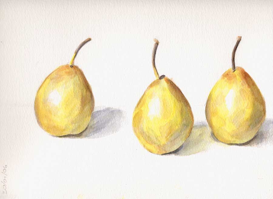
Apropos the reservations expressed in the previous post about the efficacy of using photography to represent certain aspects of the essential pearness of pears & specific physical qualities of the pears in question, I decided to make a couple of studies in order address my dissatisfaction with the results achieved using that particular medium, the first in graphite & the second in watercolour. Both, in their technical realization of form by a process of layering & accretion of visual information over a period of intense contemplation, scrutiny & decision-making, & by virtue of their own physical presence (not fully communicable here in a virtual context, alas), come closer in feeling and aesthetic to my original intention, whatever, ultimately, their sketchy nature & quality or absence of: undoubtedly, there is some form of virtue, some purpose, to be gained from the ‘hard(er)-won image’, it seems.


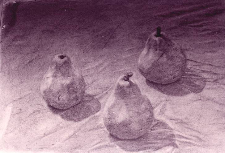
Below is featured a large-scale charcoal drawing of some Comice pears made some years ago during the course of my undergraduate studies, which seems to illustrate a much deeper level of engagement with the subject & more profound aesthetic experience altogether. This piece utilizes gorgeous, heavyweight Fabriano ‘Rosaspina’ paper, intended for printmaking but wonderfully receptive as a support for charcoal too, the surface of which breaks down easily to allow access to an underlying soft, crumbly texture perfect for retaining the marks of a drawing’s process, a record of its making and revisions (the drawing in question, like many of its contemporary fellows, was heavily worked over a period of time), layers of memory fixed in physical form, the scoring of the surface echoing that occurring on the pears with the passage of time, becoming a particular physical aspect of the drawing-as-an-object (as opposed to it being ‘merely’ two-dimensional) and incidentally giving the drawing something of the appearance of – perhaps somewhat ironically – an aged photograph, transparency or grainy film still. More of such work can be found on my art & design website, in the drawings gallery via the home page.

…And Pears

Finally removed those Chinese 'Ya' pears (see earlier post) from their protective cocoons & photographically explored their form & spatial relationships between them in a variety of natural lighting conditions (different times of the day, angles of light, different rooms). I must admit to finding these images unsatisfactory on a number of levels, not least in the failure to adequately capture the subtle beauty of the surface colour of the pears, a gorgeous pale, creamy gold, to which I was primarily attracted in the first instance: this, I believe, could have been better explored through the medium of oil paint, the consistency of which could have more appropriately represented what I can only describe as the creamy quality of the pears’ skin when experienced in the flesh.

Aesthetically, there remains something profoundly fascinating about their still, mute forms, their monumentality, their essential ‘pearness’ & ‘thing-in-itself’ quality, & I think this is communicated in some way by the photographs, yet photographing them seems such an unsatisfactory means of exploring & capturing this in comparison to drawing & painting, where time spent looking, in contemplation of formal and surface qualities seems much more rewarding and is capable of producing a more profound result.


Given what I considered to be the failure of the camera to adequately communicate the surface colour and quality, I consequently decided the pears were photographically more interesting when wreathed once again in their protective coverings, & thus snapped a few more images. I enjoy here both the surface qualities and the hints as to what lies beneath, within: form and colour, for instance. Perhaps here photography, in representing the strangeness of something actually existing, achieves a better result than drawing or painting, whose results may appear more contrived or invented, self-consciously surreal even, and therefore less convincingly believable. As ever, it’s instructive to explore the potential of any given medium for achieving the most appropriate aesthetic resolution to a given visual problem.