Friday, March 13, 2020

The Second Half of an Update


Back after our half-time orange, the Seventies project now takes a turn into what has proved to be an abiding area of interest from the middle of that decade to the present, namely European football.
I’ve blogged on this subject previously and extensively, but, basically, I got into football via the 1974 World Cup and became immersed in the game in the autumn of that year with the domestic season and the exploits of a selection of British clubs in the various continental competitions for which they had qualified. However, what most appealed, mostly, when encountered via the results pages of the Daily Mirror newspaper and, in particular, Shoot! magazine were the identities of these teams’ opponents and, in an unwitting act of un-nationalism, such gloriously exotic names became immediate and enduring favourites.

Two of these happened to feature as Liverpool’s opponents in the opening two rounds of the now sadly defunct and much-lamented European Cup-Winners’ Cup, which was pure coincidence but nevertheless acts as the inspiration for the following two drawings.

First of all, the magnificently-monikered Strømsgodset, from Drammen in Norway, presented themselves as an attractive proposition and an underdog to be embraced after receiving an 11 - 0 pasting at Anfield in the first leg of their First Round tie. Prior to the return fixture, which big match was scheduled to take place in the national Ulleval Stadium in Oslo, a particularly wet Norwegian autumn had rendered the pitch somewhat churned-up and waterlogged, apparently to such an extent that the match was under threat of postponement.

Liverpool’s star striker duo of John Toshack and Kevin Keegan - the latter of whom we’ve already encountered twice earlier in this project - were sent out to perform publicity duties and be pictured ‘testing’ the state of the surface, albeit in their civvies (admire those fashions, those flares, if you will) rather than playing kit, and the source image of this media performance provides grist to the artistic mill in this instance. Much to the Liverpool contingent’s disbelief, as subsequently reported, the match did go ahead on the ‘cow field’ and our heroes Strømsgodset managed an impressively doughty display to restrict their opponents to a mere single-goal victory on this occasion: since, they have maintained a place in my heart.


John Toshack and Kevin Keegan, Oslo,October 1974
graphite & putty eraser on ‘Seawhite’ cartridge paper/42 x 30cm

Liverpool’s reward was to progress to a Second Round meeting with Hungary’s wonderful Ferencváros, one of a number of attractive clubs from Budapest, who had previously eliminated Cardiff City from the competition after a fabulous 4 - 1 victory on Welsh soil (as I was to become a Wrexham FC supporter, historically this defeat of the most despised of rivals is thus doubly enjoyable), and it is the first leg of this match, on Merseyside, that provides the source image for the next drawing, of Liverpool, and Kevin Keegan (again!) in particular, pictured attacking the Ferencváros goal. Keegan scored on the night to give his team a lead they held until the final minute, when Maté equalised for our Hungarian heroes, a goal that ultimately proved decisive as, following a scoreless return match, Ferencváros progressed to the next round courtesy of the ‘away goals rule’ in the event of a tied aggregate, a journey that subsequently continued to the Final of the 1974 - 75 season’s Cup-Winners’, where they sadly succumbed 0 - 3 to the then-Soviet Union’s Dynamo Kiev, one of the great clubs of European football but nowhere near one of my particular favourites, even from the Ukraine.


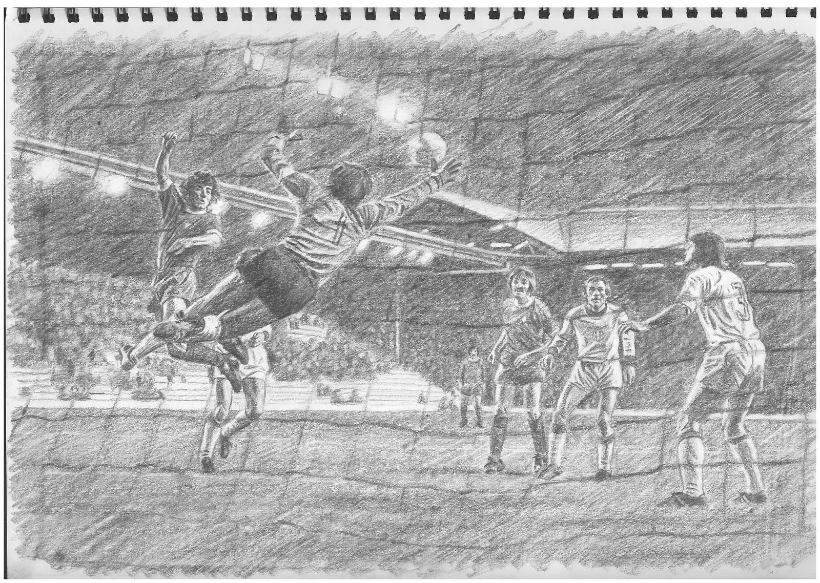
Liverpool v Ferencváros, ECWC, October 1974
graphite & putty eraser on ‘Seawhite’ cartridge paper/42 x 30cm

My first taste of live European match action came in September 1978, when I attended the Wrexham v NK Rijeka - then of Yugoslavia - European Cup-Winners’ Cup First Round, Second Leg, tie at the Racecourse Ground, where the hosts could retrieve only two of a three-goal First Leg deficit and thus departed the competition at the initial stage.
The next season saw Wrexham return to the Cup-Winners’ Cup and being drawn to play East Germany’s 1FC Magdeburg, winners of the trophy in 1974, in the First Round. As we were, of course, all schoolboy Communists at this time, such matches had a palpable exotic glamour to them, to yours truly at least, and to be there was magical indeed, to witness the action unfolding, beneath floodlights. The first leg took place at the Racecourse and it is this match that provides the source image for the following drawing, depicting Wrexham’s Steve Fox (far right) in the act of scoring his team’s equalising goal to make the score on the night 2 - 2: this was a proper cup tie of the legendary sort - Wrexham establishing a very early lead before Magdeburg recovered to 2 - 1 ahead by half-time. Fox’s goal arrived late but there still remained enough time for Wrexham to score a winning goal to take a 3 - 2 advantage to East Germany for the rematch (lost, unfortunately, 2 - 5 after extra time to again fall at the first hurdle), and it is such occasions that form the lasting memories, which those of us of a nostalgic inclination can recall fondly whilst they contribute to the personal cultural store.


Steve Fox scores, Wrexham v 1FC Magdeburg, ECWC, September 1979
graphite & putty eraser on ‘Seawhite’ cartridge paper/42 x 30cm

Next up, another sport-themed source image, this one of the author pictured some time at that particularly awkward age around the threshold of one’s teens, captured for posterity in sun-drenched colour. There is no requirement to add anything further here.


Tennis Self-Portrait, 1970s
coloured pencil on ‘Seawhite’ cartridge paper/30 x 42cm

Further to my inglorious history of being pictured pulling faces (or, perhaps, pulling faces when being photographed), the following drawing is based on a source image that is up there with the very best/worst. Taken for and published by a local newspaper in the summer of 1976, it depicts three of St Mary’s school’s ‘Prize Pupils’ clutching the books with which their academic achievements had been rewarded. The apparent loon grinning maniacally in the centre of the group of course made his parents very proud.


‘“The Prize Pupils”, 1976’
graphite & putty eraser on ‘Seawhite’ cartridge paper/30 x 42cm


Friday, March 06, 2020

Half an Update...


The recent absence of blog updates does not mean hands have been idle by any means, and the drawings for the Seventies project have continued at a regular pace as will now be illustrated.

First of all, and continuing with the Northern theme that had been developing within the project, a double portrait drawing - also incidentally incorporating a still life element - from a source image that nostalgically recalls the early evening local television news programme that was broadcast into our homes in the north east corner of Wales, courtesy of the transmitters that brought us Granada TV rather than its Welsh equivalent (for which we required a special aerial adaptor that still proved unreliable). Thus are depicted two of the presenting team of ‘Granada Reports’ in its mid-1970s’ heyday, a young Tony Wilson as apprentice to the legend that was and remains Bob Greaves, with all fashions of the day on display.


Tony Wilson and Bob Greaves, 'Granada Reports' 1970s
graphite and putty eraser on 'Seawhite' cartridge paper/42 x 30cm

Next, the hip, young cultural gunslinger Tony Wilson is his other contemporary television presenting guise as more casually-attired host of ‘So It Goes’, introducing new music to the north west region, including a selection of the punk and post-punk bands from Manchester and environs that had been formed and developed in the wake of the Sex Pistols’ legendary appearances in the city in 1976. As ‘So It Goes’ fell victim to a notorious appearance by Iggy Pop at the conclusion of its second series, so Tony Wilson’s dissemination of the new sounds found other outlets, within ‘Granada Reports’ and also, of course, with the founding of Factory Records, both of which came to feature Joy Division as they grew and became such an icon of the time and place, and proceeded to transcend both as they remain synonymous with.


Tony Wilson, 'So It Goes'
graphite and putty eraser on 'Seawhite' cartridge paper/42 x 30cm

The recently-published volume of Paul Slattery’s photographic record of Joy Division at Strawberry Studios and around the town of Stockport on 28th July, 1979, features the source image for this drawing on its cover. ‘Here are the young men’ indeed, but creating some of the most powerful and resonant music of the era. If I’m absolutely honest, I didn’t acquire my first Joy Division record, the ‘Transmission’/’Novelty’ 7” single, until the February of 1980, after which obsession took hold, but the seeds of my devotion to them had undoubtedly been sown in my soul during the previous autumn, via the auspices of the John Peel radio programme (of course), so their inclusion in the project is entirely appropriate.


Joy Division after a Paul Slattery photograph
graphite and putty eraser on 'Seawhite' cartridge paper/42 x 30cm

More musicians pictured standing (and squatting) around can be found on the cover of The Stranglers’ (my very favourite group of the time) ‘Black and White’ LP, and this image, along with the band’s iconic logo, that I would have drawn/copied often then, forms the content of the next drawing which, in effect, illustrates one of the three music albums that I received as presents for Christmas 1979 (so we’re really pushing at the limits of the Seventies here!).


The Stranglers 'Black and White'
graphite and putty eraser on 'Seawhite' cartridge paper/30 x 42cm


The others were Public Image Ltd’s ‘Metal Box’, originally released as a collection of three 12” vinyl EPs contained within a tin canister (as very sadly I no longer own this object of desire, the substitute utilised as the model for this still life is in fact the reduced-circumstances and feeble impostor CD-sized version of the can, but I’d like to feel the spirit of the original can be inferred from the representation) - I have blogged about this on a previous occasion - and The Clash’s masterpiece double LP, ‘London Calling’, the front cover of which is faithfully reproduced in pencil here. In time, one learnt of the genesis of the latter artefact’s design, by Ray Lowry, in the artwork accompanying Elvis Presley’s debut album, and of such concepts and practices as artistic influence and postmodern ‘appropriation’, but I’m sure that wasn’t of particular concern to my 1979 self!


'Metal Box'
graphite and putty eraser on 'Seawhite' cartridge paper/42 x 30cm


The Clash 'London Calling' LP sleeve (front)
graphite and putty eraser on 'Seawhite' cartridge paper/42 x 30cm


Saturday, February 01, 2020

The Seventies Go Up North (For a Beer and a Smoke)


Things have taken something of Northern turn in the Seventies project of late, with a recollection of a particular song from 1979 that us young (post-)punks took to our hearts – ‘TV Stars’, the b-side of the Skids’ ‘Into the Valley’ hit single (which we likewise favoured) – providing the inspiration to source an image featuring the particular one glorified in the song’s chanted chorus, Albert Tatlock, the cantankerous old pensioner from the cast of the soap opera that endures to this day, ‘Coronation Street’. The most appropriate image to suggest itself proved itself to be even more for also including the character of Stanley Ogden in the company of Mr Tatlock, as Stan is also celebrated within the lyrics of ‘TV Stars’ along with a pair of other ‘Street’ regulars of the time. The glee with which Ogden (played by Bernard Youens) is regarding the pint of beer he’s encouraging Albert (Jack Howarth) to appreciate is delightful in this image, the simple pleasure of a working (bin)man sharing his enthusiasm with a neighbour, and formed part of the programme’s charm back in the day when I was a regular viewer, thus there is a proper hauntological aspect and poignancy to processing such a drawing, as well as recalling our schoolboy enthusiasm for the music we were discovering and enjoying (and I still do!).

‘Albert Tatlock and Stan Ogden/Coronation Street’
Graphite and putty eraser on Seawhite cartridge paper/42 x 30cm
As a period piece itself, the picture sleeve of the Skids single is worth reproducing too.

Skids ‘Into the Valley’/’TV Stars’ 7″ single picture sleeve, 1979

 More flat caps, beer and fags in a northern setting to follow, with a representation of the Chairman of the Committee of the ‘Wheeltappers and Shunters Social Club’ (another Granada TV production), the comedian Colin Crompton, in the full flow of one of his interjections – announced by the ringing of a manual fire bell that he had on the top of the table at which he sat – during the course of the variety show based in a simulacrum (a word I wouldn’t have used at the time!) of a typical working men’s club. This was a character I can recall impersonating amongst friends.

‘Colin Crompton/Wheeltappers and Shunters Social Club’
Graphite and putty eraser on Seawhite cartridge paper/42 x 30cm
If anything upping the Northern ante yet further, the following pair of drawings represent the former England international cricketer Fred Trueman, as I recall encountering him for the first time, during his subsequent media incarnation, as the  laconic, cardigan-wearing, pipe-smoking presenter of ‘The Indoor League’, a compendium of essentially pub challenge games such as darts, bar billiards, shove ha’penny and suchlike. A man entirely at ease with himself (hardly surprising given what turned out to have been a very successful sporting career), resplendent in the fashions of the 1970s and a magnificent jet-black tonsure, Fred would sign off each programme with a gruff Yorkshire “Ah’ll sithee” (“I’ll see you”) and it is this that I recall most clearly, in fact to the exclusion of all else about the show: that wink in the first portrait surely captures just such a moment of closure.
‘”Ah’ll Sithee” (Fred Trueman/The Indoor League)’
Graphite and putty eraser on Seawhite cartridge paper/42 x 30cm

‘Fred Trueman/The Indoor League’
Graphite and putty eraser on Seawhite cartridge paper/42 x 30cm

Friday, January 31, 2020

Seventies’ Comedy Classics


More fondly-remembered TV characters and programmes form the content of this update, with representations/remediations of images featuring landlord Rigsby (Leonard Rossiter) and one of his tenants, Miss Jones (Frances de la Tour), from the sitcom ‘Rising Damp’, Rossiter in his other iconic comic role of the mid-to-late 1970s as Reginald Perrin in ‘The Fall and Rise of…’ and the cast of ‘The Good Life’, featuring the Goods, Barbara and Tom (Felicity Kendal and Richard Briers), and the Leadbetters, Margo and Jerry (Penelope Keith and Paul Eddington), all of which have gone down in the annals of British television history.
The sequence of links here is, obviously, Rossiter – Rossiter and another character, Tom Good who, like Reggie Perrin, opted-out of the stifling 9 – 5 rat race.  Interestingly, Leonard Rossiter also has a link to the subject of an earlier drawing in the Seventies project, as he played the role of Mr Shadrack in the original 1960s cinematic representation of ‘Billy Liar’, although of course the project’s Billy is from the 1970s television adaptation.
During their time in the mid-1970s, prior to the advent of video recorders – or at least these being the norm in many homes – and, now, ‘catch-up’ streaming services and multiple ‘nostalgia’ channels broadcasting such shows in heavy rotation, these programmes were a once-a-week and ‘only opportunity’ treat, an event the whole family would gather before for an amusing half hour and it’s interesting to recall that aspect of society and culture, a significant part of one’s growing-up.
‘Rising Damp’
graphite and putty eraser on Seawhite cartridge paper/42 x 30cm

‘(The Fall and Rise of) Reginald Perrin’
graphite and putty eraser on Seawhite cartridge paper/30 x 42cm

‘The Good Life’
graphite and putty eraser on Seawhite cartridge paper/42 x 30cm

Friday, January 10, 2020

Post-Yuletide Update


One of the benefits of the holiday-from-the-day-job season, at least in academic circles, is a two-week break that, among other things, allows more quality time, some of it even during daylight hours, to get some painting and/or drawing done, and this year I’ve used such opportunity to continue with the Seventies project.
The first drawing to be processed follows on from the previous one of ‘The Protectors’ in that it features a pair of representations of the picture sleeves of the 7″ vinyl record of Tony Christie‘s ‘Avenues and Alleyways’, which song provided the memorable theme tune to that particular television series. This still life is in fact something of a concoction, with images of the respective record covers sourced from the internet, drawn from prints of the images and then transformed into objects with reference to an arrangement of two physical 7″ single records in picture covers, the random choice of which, in terms of the music contained within, are individually and collectively about as far from the Christie song and production as it’s possible to imagine, even if all three are enduring classics of their kind!

‘Tony Christie “Avenues and Alleyways” 7-inch Picture Sleeves’
 coloured pencil and putty eraser on Seawhite cartridge paper/
42 x 30cm


still life composition for ‘Avenues and Alleyways’, featuring the 7″ picture sleeves of Cabaret Voltaire’s ‘Nag Nag Nag’ and the Gang of Four’s ‘Damaged Good’ EP

After ‘The Protectors’, one remembers the capers of Roger Moore and Tony Curtis as Lord Brett Sinclair and Danny Wilde, ‘The Persuaders!’ and the private detective team of ‘Randall and Hopkirk (Deceased)’ as played by Mike Pratt (on the right of the image represented in the drawing) and Kenneth Cope in white-suited ‘ghost’ mode, both of which series obviously kept me interested and entertained enough to remain in the memory bank.


‘The Persuaders!’
graphite and putty eraser on Seawhite cartridge paper/42 x 30cm


‘Randall and Hopkirk (Deceased)’
graphite and putty eraser on Seawhite cartridge paper/42 x 30cm


‘Randall and Hopkirk (Deceased)’ was remade in the 1990s starring north east Surrealist duo Vic Reeves (Jim Moir) and Bob Mortimer and this geographical and regional accent fact inspires thoughts of the Newcastle-set ‘Whatever Happened to the Likely Lads?’, which was a 1970s sequel to the original Sixties British television sitcom ‘The Likely Lads’, both starring James Bolam and Rodney Bewes, and also spawned a feature film that I recall with more clarity than others and again featured a memorable theme song including the lyric “It’s the only thing to look forward to, the past”, of particular resonance in the context of the Seventies project! The Likely Lads certainly seems to have remained an enduring favourite, a significant part of British popular culture and represents a vivid marker of its times.


‘Whatever Happened to the Likely Lads?’
graphite and putty eraser on Seawhite cartridge paper/42 x 30cm

‘Billy Liar’ is a fictional character who’s long held a place in my affections, via Keith Waterhouse’s novel (and its ‘…on the Moon’ sequel) and the 1960s film starring Tom Courtney in the title role, who I always ‘imagine’ since, but I have a dimmer recollection of my first exposure being in fact a Seventies’ sitcom production, thus the drawing below features the actor Jeff Rawle in the eponymous role, represented as one of Billy’s heroic imaginary alter-egos, the President of Ambrosia or somesuch.


‘Billy Liar’
graphite and putty eraser on Seawhite cartridge paper/30 x 42cm

Finally, another sitcom dreamer, ‘Citizen Smith’, as played by Robert Lindsay, one of whom’s revolutionary rallying cries, “Power to the People”, seems so grimly ironic  in the light of the recent UK General Election resulting in the grotesque travesty of ‘the People’s PM’ representing ‘the People’s Government’, having been returned by a significant enough proportion of an ignorant and deluded electorate – I could rant on at inordinate length of my disgust and fear at the turn of political events in the UK but will end for now and remain focused on the creative, for it’s all we have left.


‘Citizen Smith’
graphite and putty eraser on Seawhite cartridge paper/30 x 42cm