

This blog's title is based upon the best question I ever overheard being asked, by a young Liverpudlian child to his mother, as in "What's..?". The answer seems to be something of a creative and cultural nature which, in deed (primarily the making of art) and word, this blog intends to explore...








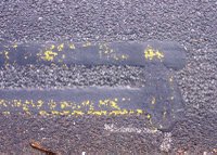
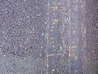
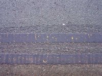
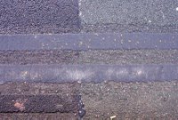
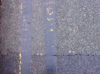
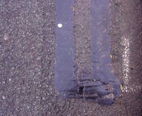
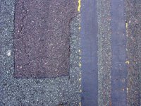
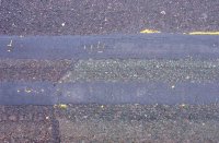
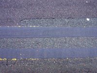
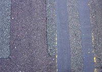
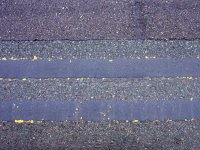
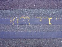
Indulging in a spot of shoegazing – old habits, literally & musically, dying hard & all that – resulted in a wonderful aesthetic find at the roadside, in the form of these quite possibly unique local ‘double black line’ road markings. They are in fact the result of a cover up operation to correct the problem of erroneously painted double yellow (vehicle parking prohibited) lines, liberally applied over extensive areas to which they shouldn’t have been. Although the black lines obviously, under such circumstances, serve a functional purpose, still I believe they deserve to be viewed as art, &, indeed, primarily so. To me, the photographs are like reproductions of a series of paintings - relating to the work of, e.g. Robert Ryman (in effect, the black images could be regarded as being 'negatives' of Ryman's white paintings), Ad Reinhardt, Barnett Newman, rather than the obvious initial ‘red herring’ reference to the work of the Boyle family & their physically modelled replicas of areas of the earth’s surface, including, specifically, sections of Tarmacked urban road - simple, modernist-minimalist compositions, yet incorporating a wealth of subtle detail in terms of:
1. colour & tonal variations on the basic ‘black’ theme (provided by both the essential distinction between the lines and the road surfaces they overlay &, in some instances, between the various patches of the repaired roads which, on occasion, can be numerous and quite varied);
2. drawing, both obviously in the lines (& their wonderful wavy, ‘uncertain’, ‘exploratory’ edges) themselves but also in the networks of cracks upon the paint surface & fissures in the underlying road surface, & furthermore in the strips of the leading edges of yellow paint left untouched by the cover up process;
3. a tangible materiality to both figure & ground - textured, ‘tactile’ space as can be found in painting;
4. a physical memory of the cumulative traces of the process of their creation & revisions (which applies to both the over-painted lines – obviously so where the underlying yellow paint shows-through - & the repaired road surfaces);
5. incidental elements, e.g. cigarette butts that neatly ‘art-reference’ the detritus embedded in the surface of some of Jackson Pollock’s paintings, paint splatters that also reference Pollock most obviously, or an engrained sprinkling of builders’ sand that adds another colour to the composition;
6. other road markings deliberately left untouched by the cover up process that again expand the compositional range.
For whatever reason – perhaps most obviously because a greater range of line detail is possible in such a format – it seems a horizontal composition is most effective, at least at this initial stage of exploration, but, displayed vertically, the markings more closely relate to, for instance, Barnett Newman’s ‘zips’, which again is fun for playful ‘referencing’ purposes, & curved areas of line provide another dynamic to the compositions altogether & suggest further possibilities.
Click on the images to access full-sized versions (this, indeed, applies to all the images posted on the blog).